> ## Documentation Index
> Fetch the complete documentation index at: https://base-a060aa97-eb-mini-app-ia-overhaul.mintlify.site/llms.txt
> Use this file to discover all available pages before exploring further.
# · OnchainKit
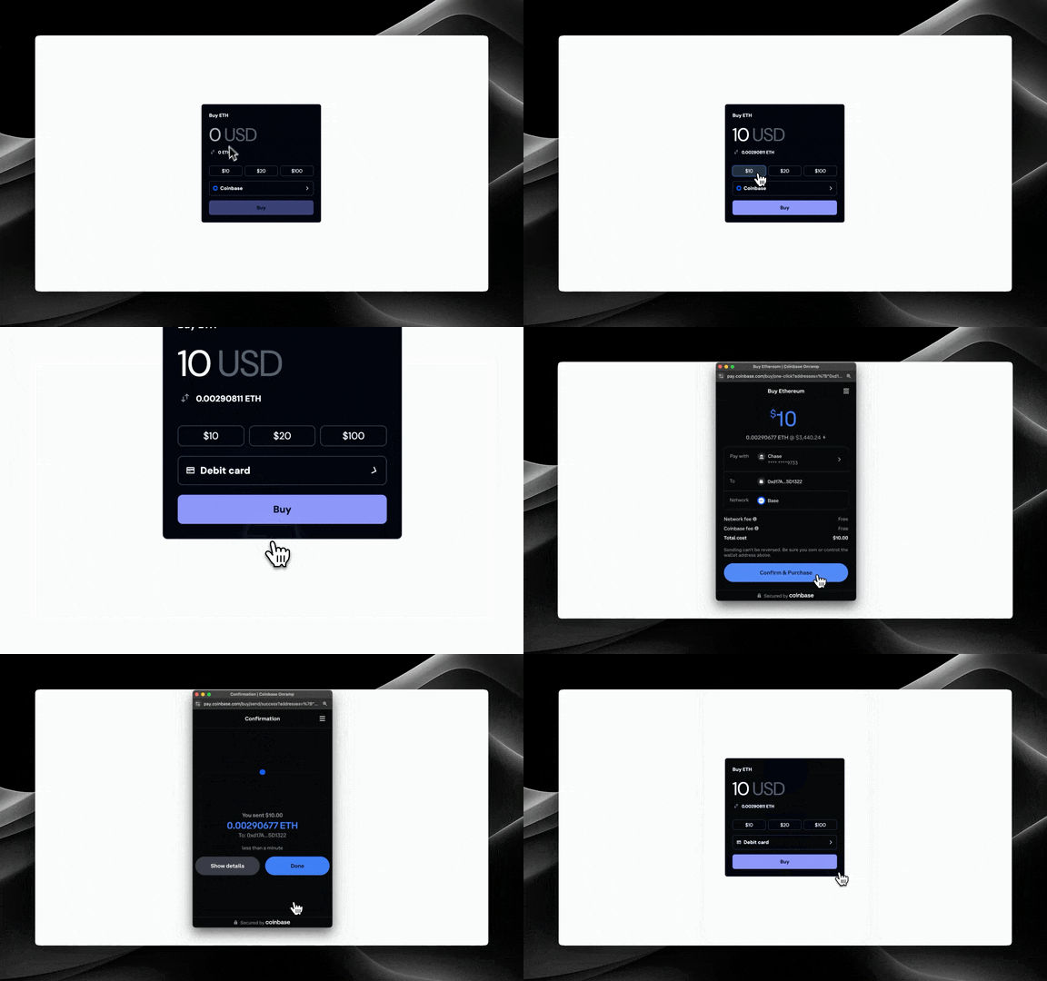
> The `` component provides a complete fiat onramp experience with amount input, currency switching, and payment method selection.
The `` component provides a complete fiat onramp experience within your app. It includes:
* Amount input with fiat/crypto switching
* Payment method selection (Coinbase, Apple Pay, Debit Card)
* Automatic exchange rate updates
* Smart handling of payment method restrictions (based on country and subdivision)
The Apple Pay and Debit Card onramp options are only available for Coinbase supported assets.
## Prerequisites
Before using the `FundCard` component, ensure you've completed the [Getting Started](/onchainkit/installation/nextjs#get-your-client-api-key) steps.
To use the `FundCard` component, you'll need to provide a Client API Key in `OnchainKitProvider`. You can get one following our [Getting Started](/onchainkit/installation/nextjs#get-your-client-api-key) steps.
This component requires a `projectId` to be set in the `OnchainKitProvider`. You can find your `projectId` on [Coinbase Developer Platform](https://portal.cdp.coinbase.com/products/onchainkit).
## Usage
### Drop in the `` component
```tsx
import { FundCard } from '@coinbase/onchainkit/fund';
;
```
{/*
{({ address }) => {
if (address) {
return ;
}
return (
<>
);
}}
*/}
## Customization
### Custom Header and Button Text
You can customize the header and button text:
```tsx
```
{/*
{({ address }) => {
if (address) {
return (
);
}
return (
<>
);
}}
*/}
### Custom Currency
You can specify which fiat currency to use:
```tsx
```
### Preset Amount Inputs
You can specify preset amount buttons:
```tsx
const presetAmountInputs = ['10', '20', '50'] as const;
;
```
**Note: 3 preset amount inputs are required in order to show the preset amount buttons.**
### Custom Content
You can provide custom children to completely customize the card content while keeping the fund button functionality:
```tsx
Custom Header
```
You can also reuse the existing children from the default implementation and add your own custom content.
```tsx
import {
FundCardHeader,
FundCardAmountInput,
FundCardAmountInputTypeSwitch,
FundCardPresetAmountInputList,
FundCardPaymentMethodDropdown,
FundCardSubmitButton,
} from '@coinbase/onchainkit/fund';
Custom Header instead of the default "FundCardHeader"
Any custom content
Any custom content
```
**Note:** If you are using the custom components then you are going to need to access the state of the `FundCard` component. You can do this by using the `useFundContext` hook.
```tsx
const {
asset,
currency,
selectedPaymentMethod,
setSelectedPaymentMethod,
fundAmountFiat,
setFundAmountFiat,
fundAmountCrypto,
setFundAmountCrypto,
selectedInputType,
setSelectedInputType,
exchangeRate,
setExchangeRate,
exchangeRateLoading,
setExchangeRateLoading,
submitButtonState,
setSubmitButtonState,
paymentMethods,
setPaymentMethods,
paymentMethodsLoading,
setPaymentMethodsLoading,
headerText,
buttonText,
country,
subdivision,
lifecycleStatus,
updateLifecycleStatus,
presetAmountInputs,
} = useFundContext();
```
## Props
* [`FundCardPropsReact`](/onchainkit/fund/types#fundcardpropsreact)
## Related Components
* [``](/onchainkit/fund/fund-button)
 The `
The `