> ## Documentation Index
> Fetch the complete documentation index at: https://base-a060aa97-eb-mini-app-ia-overhaul.mintlify.site/llms.txt
> Use this file to discover all available pages before exploring further.
# OnchainKit Themes · OnchainKit
> Customize the appearance of OnchainKit's components
 ## Overview
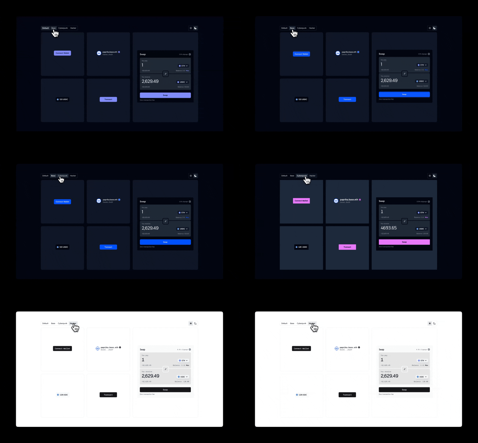
OnchainKit provides flexible appearance control through two main features: `mode` and `theme`.
* **Mode**: Controls the light/dark appearance and includes an auto option that inherits the system preference.
* **Theme**: Governs the overall styling across components.
You can choose from built-in themes or dynamically switch modes based on user preference or system settings, allowing for a customized and responsive user interface.
## Built-in Themes
OnchainKit offers multiple themes to quickly style your components. Set the theme via the `OnchainKitProvider` using `config.appearance.theme`:
* `default`: Includes both light and dark modes.
* `base`: Single mode only.
* `cyberpunk`: Single mode only.
* `hacker`: Single mode only.
* `custom`: Single mode only.
If no theme is selected, the **`default`** theme is applied automatically.
```tsx
// @noErrors: 2304 17008 1005
```
## Mode
Control the color scheme by setting the `config.appearance.mode` property of the `OnchainKitProvider`:
* `auto`: Automatically switches between light and dark mode based on the user’s OS preference.
* `light`: Forces all components to use the light version of the theme.
* `dark`: Forces all components to use the dark version of the theme.
If no mode is specified, `auto` mode will be applied by default.
```tsx
// @noErrors: 2304 17008 1005
```
## CSS Overrides
Fine-tune specific aspects of an existing theme.
This is useful when you want to make adjustments to the appearance of the components without creating an entirely new theme.
```css
@layer base {
:root
.default-light,
.default-dark,
.base,
.cyberpunk,
.hacker {
/* Override specific variables as needed */
--ock-font-family: 'your-custom-value';
--ock-border-radius: 'your-custom-value';
--ock-text-primary: 'your-custom-value';
}
}
```
## Custom Theme
Define an entirely new look and feel for your application.
This gives you complete control over all aspects of the design, including colors, fonts, and other visual properties.
#### Usage Options:
##### Automatic Light/Dark Mode Switching:
* To automatically switch between light and dark versions of your custom theme:
```tsx
// @noErrors: 2304 17008 1005
```
##### Single Theme Version:
* To use only one version of your custom theme at all times:
```tsx
// @noErrors: 2304 17008 1005
```
##### Defining a custom theme
Use CSS variables to define your custom theme.
The class name definitions must include the `-light` or `-dark` suffix.
```css
.custom-light {
/* Font and Shape */
--ock-font-family: 'your-custom-value';
--ock-border-radius: 'your-custom-value';
--ock-border-radius-inner: 'your-custom-value';
/* Text Colors */
--ock-text-inverse: 'your-custom-value';
--ock-text-foreground: 'your-custom-value';
--ock-text-foreground-muted: 'your-custom-value';
--ock-text-error: 'your-custom-value';
--ock-text-primary: 'your-custom-value';
--ock-text-success: 'your-custom-value';
--ock-text-warning: 'your-custom-value';
--ock-text-disabled: 'your-custom-value';
/* Background Colors */
--ock-bg-default: 'your-custom-value';
--ock-bg-default-hover: 'your-custom-value';
--ock-bg-default-active: 'your-custom-value';
--ock-bg-alternate: 'your-custom-value';
--ock-bg-alternate-hover: 'your-custom-value';
--ock-bg-alternate-active: 'your-custom-value';
--ock-bg-inverse: 'your-custom-value';
--ock-bg-inverse-hover: 'your-custom-value';
--ock-bg-inverse-active: 'your-custom-value';
--ock-bg-primary: 'your-custom-value';
--ock-bg-primary-hover: 'your-custom-value';
--ock-bg-primary-active: 'your-custom-value';
--ock-bg-primary-washed: 'your-custom-value';
--ock-bg-primary-disabled: 'your-custom-value';
--ock-bg-secondary: 'your-custom-value';
--ock-bg-secondary-hover: 'your-custom-value';
--ock-bg-secondary-active: 'your-custom-value';
--ock-bg-error: 'your-custom-value';
--ock-bg-warning: 'your-custom-value';
--ock-bg-success: 'your-custom-value';
--ock-bg-default-reverse: 'your-custom-value';
/* Icon Colors */
--ock-icon-color-primary: 'your-custom-value';
--ock-icon-color-foreground: 'your-custom-value';
--ock-icon-color-foreground-muted: 'your-custom-value';
--ock-icon-color-inverse: 'your-custom-value';
--ock-icon-color-error: 'your-custom-value';
--ock-icon-color-success: 'your-custom-value';
--ock-icon-color-warning: 'your-custom-value';
/* Border Colors */
--ock-border-line-primary: 'your-custom-value';
--ock-border-line-default: 'your-custom-value';
--ock-border-line-heavy: 'your-custom-value';
--ock-border-line-inverse: 'your-custom-value';
}
.custom-dark {
/* Define dark mode custom classes here */
}
```
## Overview
OnchainKit provides flexible appearance control through two main features: `mode` and `theme`.
* **Mode**: Controls the light/dark appearance and includes an auto option that inherits the system preference.
* **Theme**: Governs the overall styling across components.
You can choose from built-in themes or dynamically switch modes based on user preference or system settings, allowing for a customized and responsive user interface.
## Built-in Themes
OnchainKit offers multiple themes to quickly style your components. Set the theme via the `OnchainKitProvider` using `config.appearance.theme`:
* `default`: Includes both light and dark modes.
* `base`: Single mode only.
* `cyberpunk`: Single mode only.
* `hacker`: Single mode only.
* `custom`: Single mode only.
If no theme is selected, the **`default`** theme is applied automatically.
```tsx
// @noErrors: 2304 17008 1005
```
## Mode
Control the color scheme by setting the `config.appearance.mode` property of the `OnchainKitProvider`:
* `auto`: Automatically switches between light and dark mode based on the user’s OS preference.
* `light`: Forces all components to use the light version of the theme.
* `dark`: Forces all components to use the dark version of the theme.
If no mode is specified, `auto` mode will be applied by default.
```tsx
// @noErrors: 2304 17008 1005
```
## CSS Overrides
Fine-tune specific aspects of an existing theme.
This is useful when you want to make adjustments to the appearance of the components without creating an entirely new theme.
```css
@layer base {
:root
.default-light,
.default-dark,
.base,
.cyberpunk,
.hacker {
/* Override specific variables as needed */
--ock-font-family: 'your-custom-value';
--ock-border-radius: 'your-custom-value';
--ock-text-primary: 'your-custom-value';
}
}
```
## Custom Theme
Define an entirely new look and feel for your application.
This gives you complete control over all aspects of the design, including colors, fonts, and other visual properties.
#### Usage Options:
##### Automatic Light/Dark Mode Switching:
* To automatically switch between light and dark versions of your custom theme:
```tsx
// @noErrors: 2304 17008 1005
```
##### Single Theme Version:
* To use only one version of your custom theme at all times:
```tsx
// @noErrors: 2304 17008 1005
```
##### Defining a custom theme
Use CSS variables to define your custom theme.
The class name definitions must include the `-light` or `-dark` suffix.
```css
.custom-light {
/* Font and Shape */
--ock-font-family: 'your-custom-value';
--ock-border-radius: 'your-custom-value';
--ock-border-radius-inner: 'your-custom-value';
/* Text Colors */
--ock-text-inverse: 'your-custom-value';
--ock-text-foreground: 'your-custom-value';
--ock-text-foreground-muted: 'your-custom-value';
--ock-text-error: 'your-custom-value';
--ock-text-primary: 'your-custom-value';
--ock-text-success: 'your-custom-value';
--ock-text-warning: 'your-custom-value';
--ock-text-disabled: 'your-custom-value';
/* Background Colors */
--ock-bg-default: 'your-custom-value';
--ock-bg-default-hover: 'your-custom-value';
--ock-bg-default-active: 'your-custom-value';
--ock-bg-alternate: 'your-custom-value';
--ock-bg-alternate-hover: 'your-custom-value';
--ock-bg-alternate-active: 'your-custom-value';
--ock-bg-inverse: 'your-custom-value';
--ock-bg-inverse-hover: 'your-custom-value';
--ock-bg-inverse-active: 'your-custom-value';
--ock-bg-primary: 'your-custom-value';
--ock-bg-primary-hover: 'your-custom-value';
--ock-bg-primary-active: 'your-custom-value';
--ock-bg-primary-washed: 'your-custom-value';
--ock-bg-primary-disabled: 'your-custom-value';
--ock-bg-secondary: 'your-custom-value';
--ock-bg-secondary-hover: 'your-custom-value';
--ock-bg-secondary-active: 'your-custom-value';
--ock-bg-error: 'your-custom-value';
--ock-bg-warning: 'your-custom-value';
--ock-bg-success: 'your-custom-value';
--ock-bg-default-reverse: 'your-custom-value';
/* Icon Colors */
--ock-icon-color-primary: 'your-custom-value';
--ock-icon-color-foreground: 'your-custom-value';
--ock-icon-color-foreground-muted: 'your-custom-value';
--ock-icon-color-inverse: 'your-custom-value';
--ock-icon-color-error: 'your-custom-value';
--ock-icon-color-success: 'your-custom-value';
--ock-icon-color-warning: 'your-custom-value';
/* Border Colors */
--ock-border-line-primary: 'your-custom-value';
--ock-border-line-default: 'your-custom-value';
--ock-border-line-heavy: 'your-custom-value';
--ock-border-line-inverse: 'your-custom-value';
}
.custom-dark {
/* Define dark mode custom classes here */
}
```