> ## Documentation Index
> Fetch the complete documentation index at: https://base-a060aa97-eb-mini-app-ia-overhaul.mintlify.site/llms.txt
> Use this file to discover all available pages before exploring further.
# · OnchainKit
> View NFTs with OnchainKit
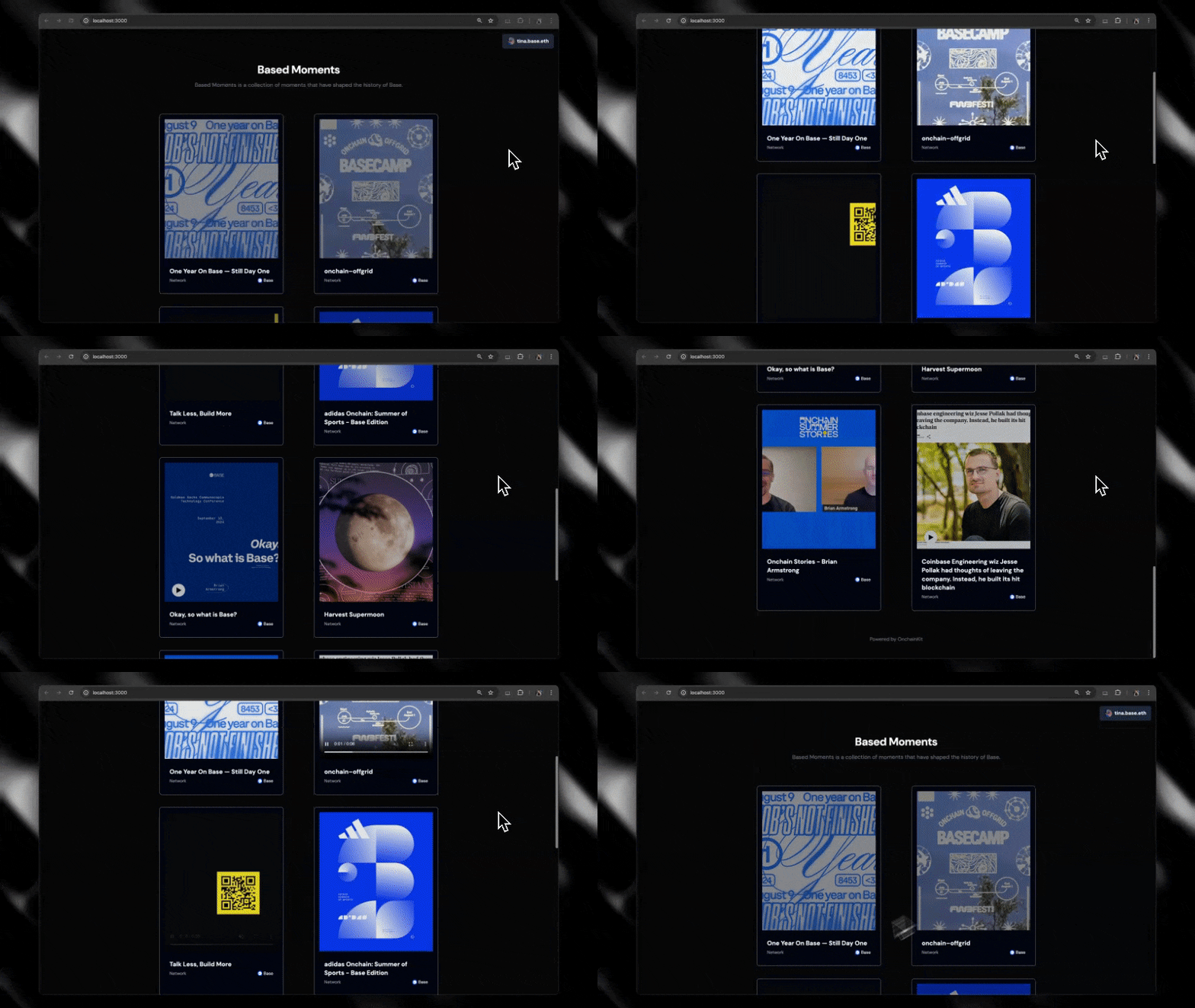
The `NFTCard` component provides an easy way to view any NFT. Just enter the NFT contract address and token Id and include the child components you want to render.
 ## Prerequisites
Before using the `NFTCard` component, ensure you've completed the [Getting Started](/onchainkit/getting-started) steps.
To use the `NFTCard` component, you'll need to provide an API Key in `OnchainKitProvider`. You can get one following our [Getting Started](/onchainkit/getting-started#get-your-public-api-key) steps.
### Starting a new project
If you're starting a new project, we recommend using `create onchain` to scaffold your project.
```bash
npm create onchain@latest
```
### Adding to an existing project
If you're adding `NFTCard` to an existing project, simply install OnchainKit.
```bash npm
npm install @coinbase/onchainkit
```
```bash yarn
yarn add @coinbase/onchainkit
```
```bash pnpm
pnpm add @coinbase/onchainkit
```
```bash bun
bun add @coinbase/onchainkit
```
Wrap the `` around your app, following the steps in [Getting Started](/onchainkit/getting-started#add-providers).
## Quickstart
The `NFTCardDefault` component is a simplified version of the `NFTCard` component, designed to streamline the integration process for developers. Instead of manually defining each subcomponent, developers can use this shorthand version which renders our suggested implementation of the component and includes `NFTTitle`, `NFTMedia`, `NFTOwner`, `NFTLastSoldPrice` and `NFTNetwork`.
```tsx
import { NFTCardDefault } from '@coinbase/onchainkit/nft'; // [!code focus]
// [!code focus]
```
If you'd like more customization you can follow the steps below to customize which subcomponents are rendered.
```tsx
// @noErrors: 2741 - Property children missing in type
import { NFTCard } from '@coinbase/onchainkit/nft'; // [!code focus]
```
```tsx
import { NFTCard } from '@coinbase/onchainkit/nft';
import {
NFTLastSoldPrice, // [!code ++]
NFTMedia, // [!code ++]
NFTNetwork, // [!code ++]
NFTOwner, // [!code ++]
NFTTitle, // [!code ++]
} from '@coinbase/onchainkit/nft/view'; // [!code ++]
```
{/* */}
That's it! You've now created an NFT card.
## Customization
### Add the NFTCard subcomponents in any order
If you prefer to have the title above the media, you can easily change the order of the subcomponents and they will render in the new order.
```tsx
import { NFTCard } from '@coinbase/onchainkit/nft';
import {
NFTMedia,
NFTTitle,
} from '@coinbase/onchainkit/nft/view';
// ---cut-before---
// ---cut-after---
```
{/* */}
### Customize the `` aspect ratio
By default, we display all media scaled to fit the card. If you would prefer to show the media at its original aspect ratio you can set `square={false}` on the `` component.
```tsx
import { NFTCard } from '@coinbase/onchainkit/nft';
import {
NFTMedia,
} from '@coinbase/onchainkit/nft/view';
// ---cut-before---
// ---cut-after---
```
{/* | Scaled to fit (default) | Original Aspect Ratio |
|-----------------|------------|
| | | */}
### Override styles
We recommend style customization by setting a custom [OnchainKit theme](/onchainkit/guides/themes#custom-theme). You can also override individual component styles using `className`.
```tsx
import { NFTCard } from '@coinbase/onchainkit/nft';
import {
NFTMedia,
NFTTitle,
} from '@coinbase/onchainkit/nft/view';
export default function NFTComponent() {
return (
// ---cut-before---
// ---cut-after---
);
}
```
{/* */}
## Advanced Usage
### Bring your own data
The default `NFTCard` implementation uses Coinbase Developer Platform to provide the data and requires an API key. If you would like to use your own data, you can use the `useNFTData` prop to pass in a hook which fetches the NFT data from a source of your choice. As long as this hook returns an object with the same shape as the [`NFTData`](/onchainkit/mint/types#nftdata) type, the NFTCard will render.
```tsx
import { NFTCard } from '@coinbase/onchainkit/nft';
import {
NFTMedia,
NFTTitle,
} from '@coinbase/onchainkit/nft/view';
// ---cut-before---
function useNFTData() { // [!code focus]
return { // [!code focus]
title: 'My NFT', // [!code focus]
imageUrl: 'https://example.com/image.png', // [!code focus]
} // [!code focus]
} // [!code focus]
export default function NFTComponent() {
return (
);
}
```
### Listening to the component lifecycle
You can use our NFT [`LifecycleStatus`](/onchainkit/mint/types#lifecyclestatus) and the `onStatus` prop to listen to transaction states.
NFTCard has 4 lifecycle states:
* `init` - The component is initialized
* `error` - The component has encountered an error
* `mediaLoading` - The media is loading
* `success` - The media has been loaded
```tsx
import { NFTCard } from '@coinbase/onchainkit/nft';
import { NFTMedia } from '@coinbase/onchainkit/nft/view';
// ---cut-before---
import type { LifecycleStatus } from '@coinbase/onchainkit/nft'; // [!code focus]
const statusHandler = (status: LifecycleStatus) => { // [!code focus]
const { statusName, statusData } = status; // [!code focus]
switch (statusName) { // [!code focus]
case 'success': // [!code focus]
// handle success
case 'error': // [!code focus]
// handle error
default: // [!code focus]
// handle 'init' state
} // [!code focus]
} // [!code focus]
// ---cut-after---
```
## Example use cases
* **Display your favorite NFT:** Create your own gallery showcasing your favorite NFTs
* **Display a minted in game avatar:** Allow your users to mint and then view a minted avatar
## Components
The `NFTCard` component can be customized with the following components:
* `` - The media for the NFT, this includes support for images, videos and audio NFTs.
* `` - The title of the NFT.
* `` - Displays the Owners Avatar, name or address and badge (if applicable).
* `` - The last sold price of the NFT in native currency and USD.
* `` - The network the NFT is on, currently only BASE NFTs are supported.
## Props
* [`LifecycleStatus`](/onchainkit/mint/types#lifecyclestatus)
* [`NFTCardReact`](/onchainkit/mint/types#nftcardreact)
* [`NFTData`](/onchainkit/mint/types#nftdata)
## Prerequisites
Before using the `NFTCard` component, ensure you've completed the [Getting Started](/onchainkit/getting-started) steps.
To use the `NFTCard` component, you'll need to provide an API Key in `OnchainKitProvider`. You can get one following our [Getting Started](/onchainkit/getting-started#get-your-public-api-key) steps.
### Starting a new project
If you're starting a new project, we recommend using `create onchain` to scaffold your project.
```bash
npm create onchain@latest
```
### Adding to an existing project
If you're adding `NFTCard` to an existing project, simply install OnchainKit.
```bash npm
npm install @coinbase/onchainkit
```
```bash yarn
yarn add @coinbase/onchainkit
```
```bash pnpm
pnpm add @coinbase/onchainkit
```
```bash bun
bun add @coinbase/onchainkit
```
Wrap the `` around your app, following the steps in [Getting Started](/onchainkit/getting-started#add-providers).
## Quickstart
The `NFTCardDefault` component is a simplified version of the `NFTCard` component, designed to streamline the integration process for developers. Instead of manually defining each subcomponent, developers can use this shorthand version which renders our suggested implementation of the component and includes `NFTTitle`, `NFTMedia`, `NFTOwner`, `NFTLastSoldPrice` and `NFTNetwork`.
```tsx
import { NFTCardDefault } from '@coinbase/onchainkit/nft'; // [!code focus]
// [!code focus]
```
If you'd like more customization you can follow the steps below to customize which subcomponents are rendered.
```tsx
// @noErrors: 2741 - Property children missing in type
import { NFTCard } from '@coinbase/onchainkit/nft'; // [!code focus]
```
```tsx
import { NFTCard } from '@coinbase/onchainkit/nft';
import {
NFTLastSoldPrice, // [!code ++]
NFTMedia, // [!code ++]
NFTNetwork, // [!code ++]
NFTOwner, // [!code ++]
NFTTitle, // [!code ++]
} from '@coinbase/onchainkit/nft/view'; // [!code ++]
```
{/* */}
That's it! You've now created an NFT card.
## Customization
### Add the NFTCard subcomponents in any order
If you prefer to have the title above the media, you can easily change the order of the subcomponents and they will render in the new order.
```tsx
import { NFTCard } from '@coinbase/onchainkit/nft';
import {
NFTMedia,
NFTTitle,
} from '@coinbase/onchainkit/nft/view';
// ---cut-before---
// ---cut-after---
```
{/* */}
### Customize the `` aspect ratio
By default, we display all media scaled to fit the card. If you would prefer to show the media at its original aspect ratio you can set `square={false}` on the `` component.
```tsx
import { NFTCard } from '@coinbase/onchainkit/nft';
import {
NFTMedia,
} from '@coinbase/onchainkit/nft/view';
// ---cut-before---
// ---cut-after---
```
{/* | Scaled to fit (default) | Original Aspect Ratio |
|-----------------|------------|
| | | */}
### Override styles
We recommend style customization by setting a custom [OnchainKit theme](/onchainkit/guides/themes#custom-theme). You can also override individual component styles using `className`.
```tsx
import { NFTCard } from '@coinbase/onchainkit/nft';
import {
NFTMedia,
NFTTitle,
} from '@coinbase/onchainkit/nft/view';
export default function NFTComponent() {
return (
// ---cut-before---
// ---cut-after---
);
}
```
{/* */}
## Advanced Usage
### Bring your own data
The default `NFTCard` implementation uses Coinbase Developer Platform to provide the data and requires an API key. If you would like to use your own data, you can use the `useNFTData` prop to pass in a hook which fetches the NFT data from a source of your choice. As long as this hook returns an object with the same shape as the [`NFTData`](/onchainkit/mint/types#nftdata) type, the NFTCard will render.
```tsx
import { NFTCard } from '@coinbase/onchainkit/nft';
import {
NFTMedia,
NFTTitle,
} from '@coinbase/onchainkit/nft/view';
// ---cut-before---
function useNFTData() { // [!code focus]
return { // [!code focus]
title: 'My NFT', // [!code focus]
imageUrl: 'https://example.com/image.png', // [!code focus]
} // [!code focus]
} // [!code focus]
export default function NFTComponent() {
return (
);
}
```
### Listening to the component lifecycle
You can use our NFT [`LifecycleStatus`](/onchainkit/mint/types#lifecyclestatus) and the `onStatus` prop to listen to transaction states.
NFTCard has 4 lifecycle states:
* `init` - The component is initialized
* `error` - The component has encountered an error
* `mediaLoading` - The media is loading
* `success` - The media has been loaded
```tsx
import { NFTCard } from '@coinbase/onchainkit/nft';
import { NFTMedia } from '@coinbase/onchainkit/nft/view';
// ---cut-before---
import type { LifecycleStatus } from '@coinbase/onchainkit/nft'; // [!code focus]
const statusHandler = (status: LifecycleStatus) => { // [!code focus]
const { statusName, statusData } = status; // [!code focus]
switch (statusName) { // [!code focus]
case 'success': // [!code focus]
// handle success
case 'error': // [!code focus]
// handle error
default: // [!code focus]
// handle 'init' state
} // [!code focus]
} // [!code focus]
// ---cut-after---
```
## Example use cases
* **Display your favorite NFT:** Create your own gallery showcasing your favorite NFTs
* **Display a minted in game avatar:** Allow your users to mint and then view a minted avatar
## Components
The `NFTCard` component can be customized with the following components:
* `` - The media for the NFT, this includes support for images, videos and audio NFTs.
* `` - The title of the NFT.
* `` - Displays the Owners Avatar, name or address and badge (if applicable).
* `` - The last sold price of the NFT in native currency and USD.
* `` - The network the NFT is on, currently only BASE NFTs are supported.
## Props
* [`LifecycleStatus`](/onchainkit/mint/types#lifecyclestatus)
* [`NFTCardReact`](/onchainkit/mint/types#nftcardreact)
* [`NFTData`](/onchainkit/mint/types#nftdata)